
Periods Matter
The Opportunity
The Homeless Period Wolverhampton launched in 2018 and became a registered charity in 2019, initially focusing on supporting women experiencing homelessness to access period products and other essential items. The charity soon realised the extent of period poverty being experienced by all women and girls across Wolverhampton and decided to extend their services to support anyone in need.
With this change of emphasis they decided they needed to also change their charity name in order for their important message to reach further. The charity founder Clare and the inspiring team of volunteers also do a lot of work with education and campaigning to bring about positive change so the new name and identity needed to be direct and fearless to amplify their important message.
I held an informal brand workshop with the team to really understand what the charity stands for, what makes them different, what challenges they have to overcome, who their key stakeholders are and what opportunities might be on the horizon. From this session I developed a range of new name options and Periods Matter was born. A bold statement, the new name gets to the core of their message – periods matter, women matter, any person from any community in need matters, and the charity are there to support them.

Previous logo

New logo

As a result of the workshop I was also able to construct a brand essence document for the charity which encapsulated their essence for being, and define their key stakeholders and audiences, what makes their extraordinary work different, what their personality is as a brand and what they value the most. This snapshot document acts as a useful tool to revisit to ensure messaging is always on brand, that new projects and initiatives feel like they are in line with the brand’s values and mission, and for all the team of volunteers to understand the vision of the charity.

The Identity
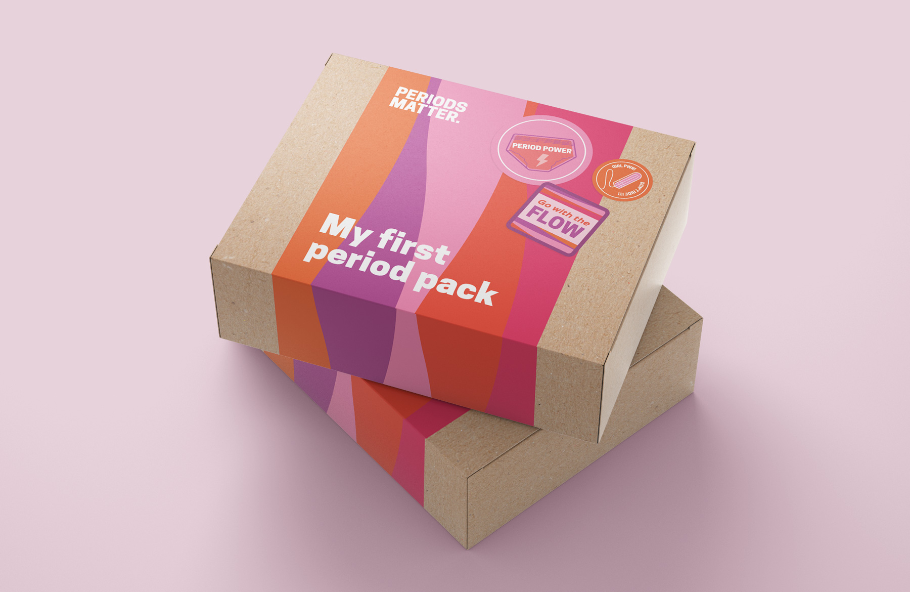
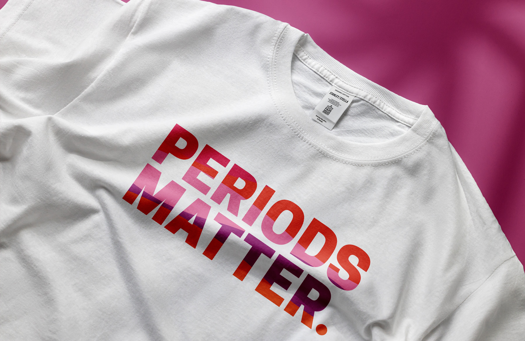
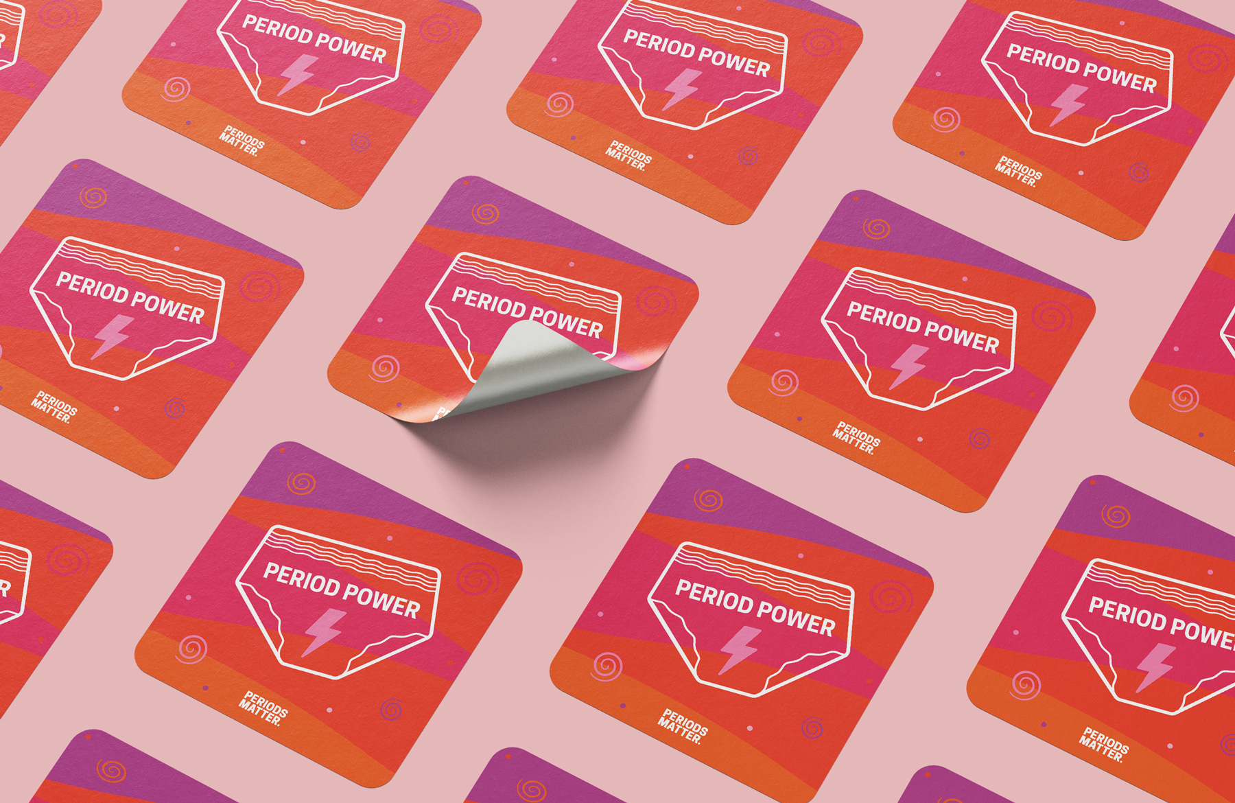
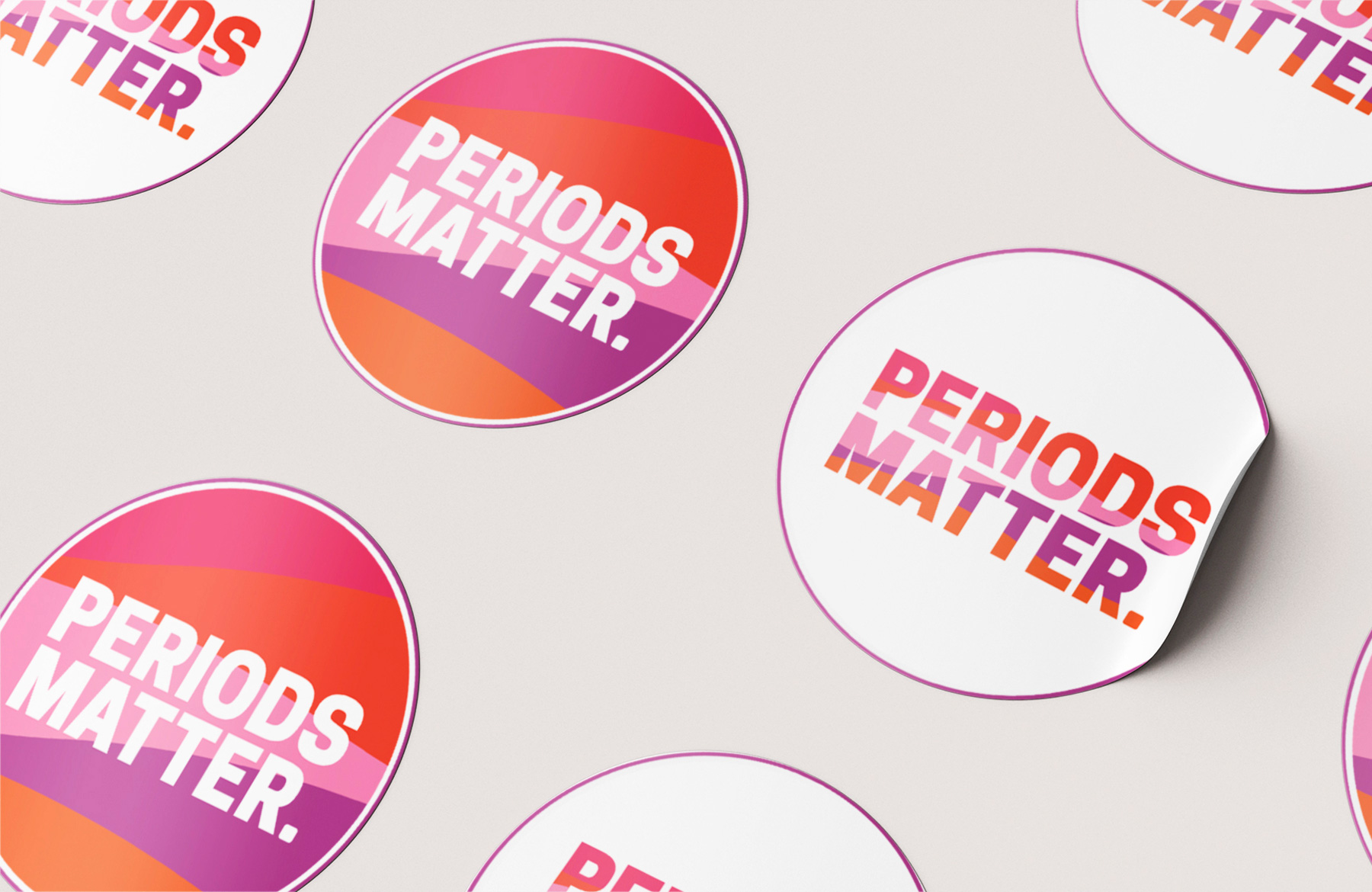
The new logo is bold, confident and empowering, helping to normalise the word ‘period’ which until more recently was surrounded by taboo. Presented in strong capital letters it makes a statement, and flowing layers of bright pinks, red, orange and purples are a bold reference to bleeding which feels both feminine but fearless.

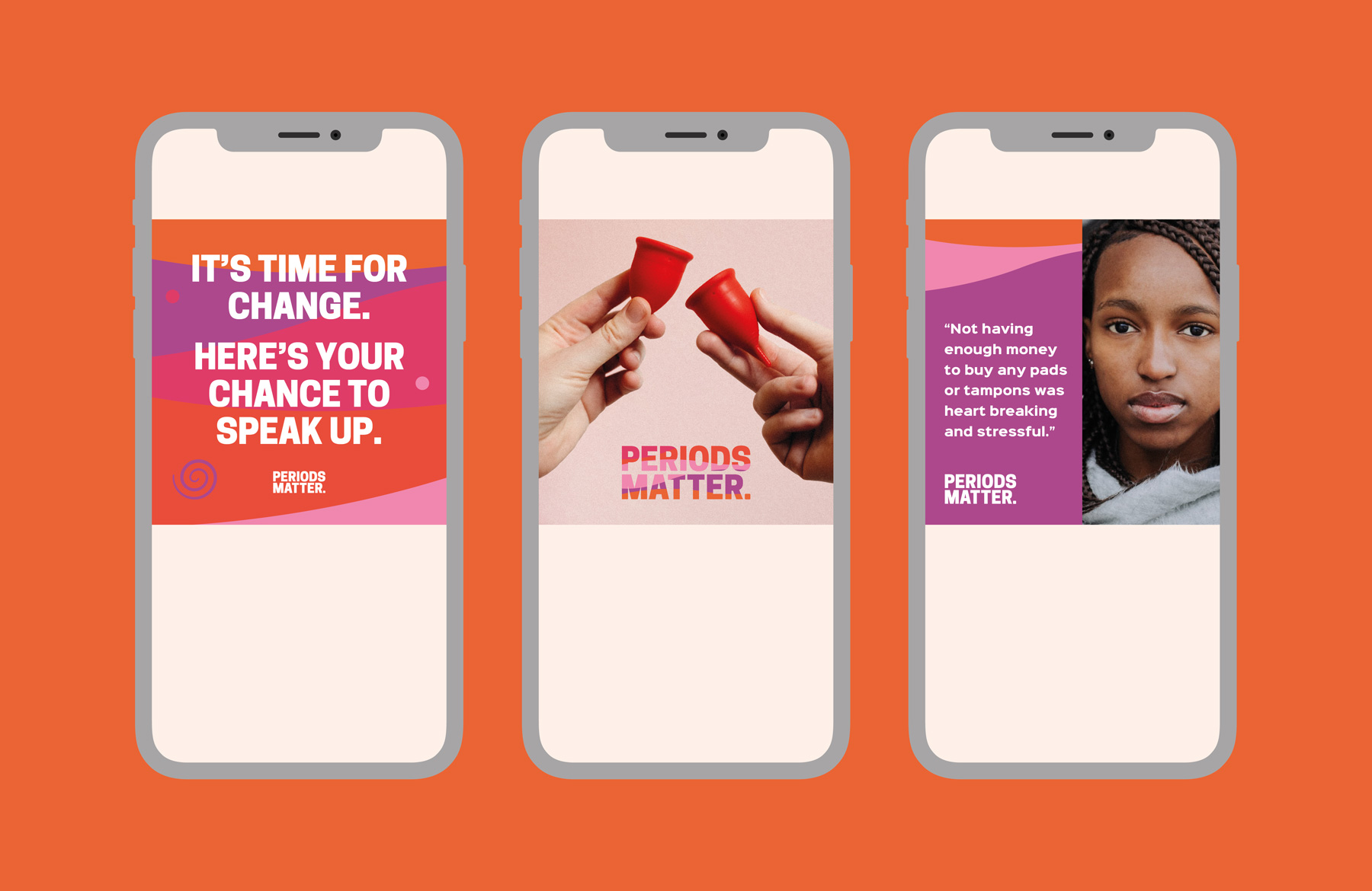
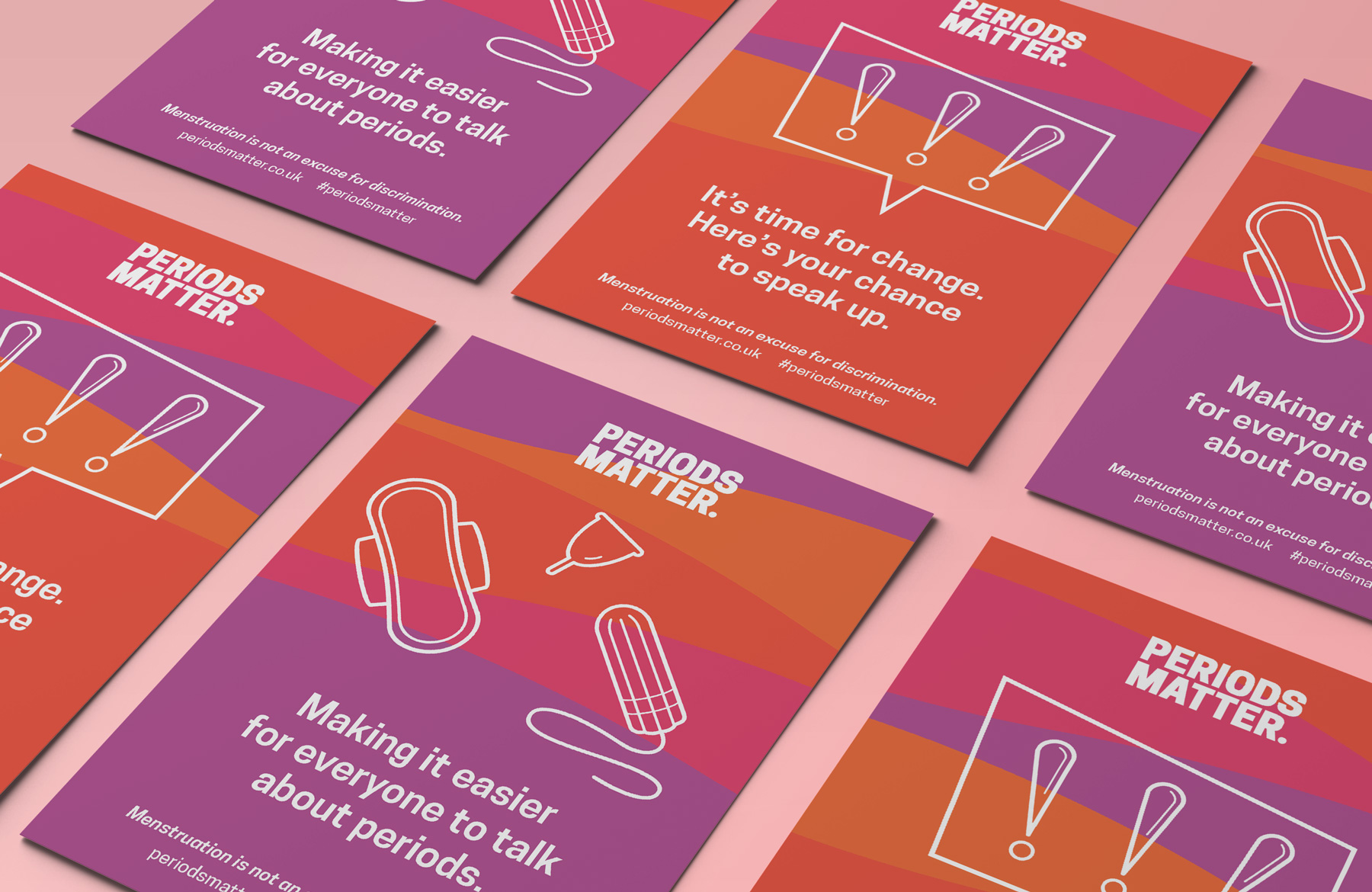
The brand toolkit includes a set of clean line illustrations which are playful and help to communicate themes graphically and offer a pictorial explanation for messaging in situations where there may be an initial language barrier with some audiences. Bold typographic statements help to bring these illustrations to life on campaign material and merchandise.

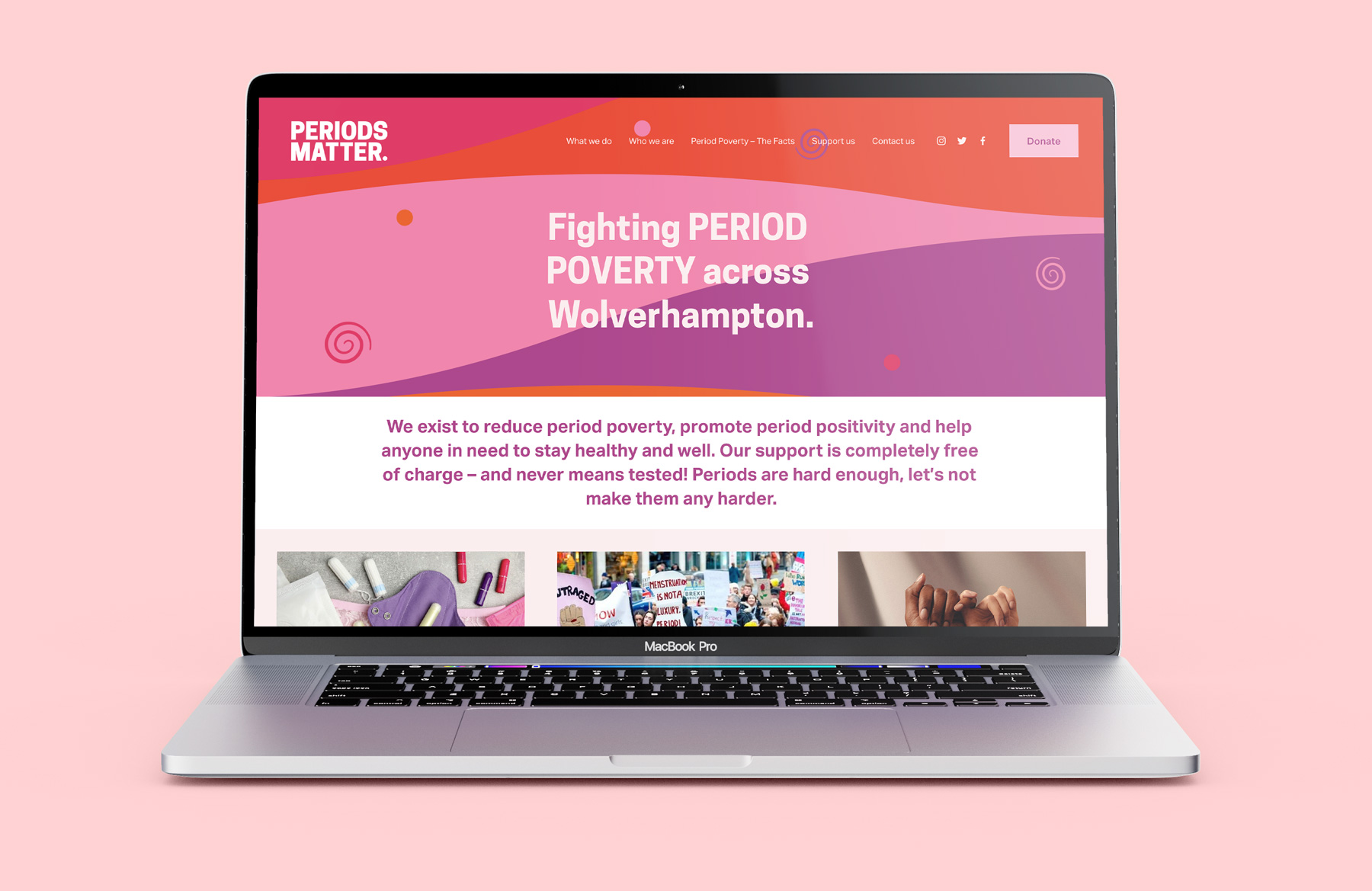
To help the new brand launch I created a set of print items which would help the team at their fundraising and education events, including a set of postcards, pin badges and stickers, promotional banners, t-shirts and labels for the charity’s My First Period packs which are distributed in schools and community settings. I also designed a host of editable branded templates for social media and built a brand new website which helps to tell the charity’s story, highlight the free support on offer, educate people on period poverty and promote the range of ways people can support the charity.
We worked with Lindsay to help us design and deliver a complete rebrand and rename of our charity from The Homeless Period - Wolverhampton to Periods Matter. This was a huge step for us and Lindsay was fantastic and infinitely patient and professional ensuring all views were taken onto account and we were steered in the right direction.The resulting brand identity and website are amazing and we have received a huge amount of positive feedback. One individual even stated it was great to see a local charity with national level branding!
Clare Roberts-Molloy, Periods Matter founder


