Wayfinding for MAC
MAC Birmingham were looking for a refreshed signage and wayfinding system to coincide with their reopening to the public in 2021. The system needed to replace and refresh outdated and inconsistent signage and help address new requirements for COVID-19 messaging and instructions throughout the building. A renewed navigation system was created to enhance a visitors’ journey around the centre, making routes to the art centre’s many different spaces easier to understand and welcoming visitors to the newly built arts and café spaces.
Through a number of site visits, patterns of visitor behaviour were identified, highlighting the need for more consistent and clear directional signage throughout the building. A host of approaches, materials and design prototypes were researched and tested to ensure the new system would fit the arts centre’s needs.
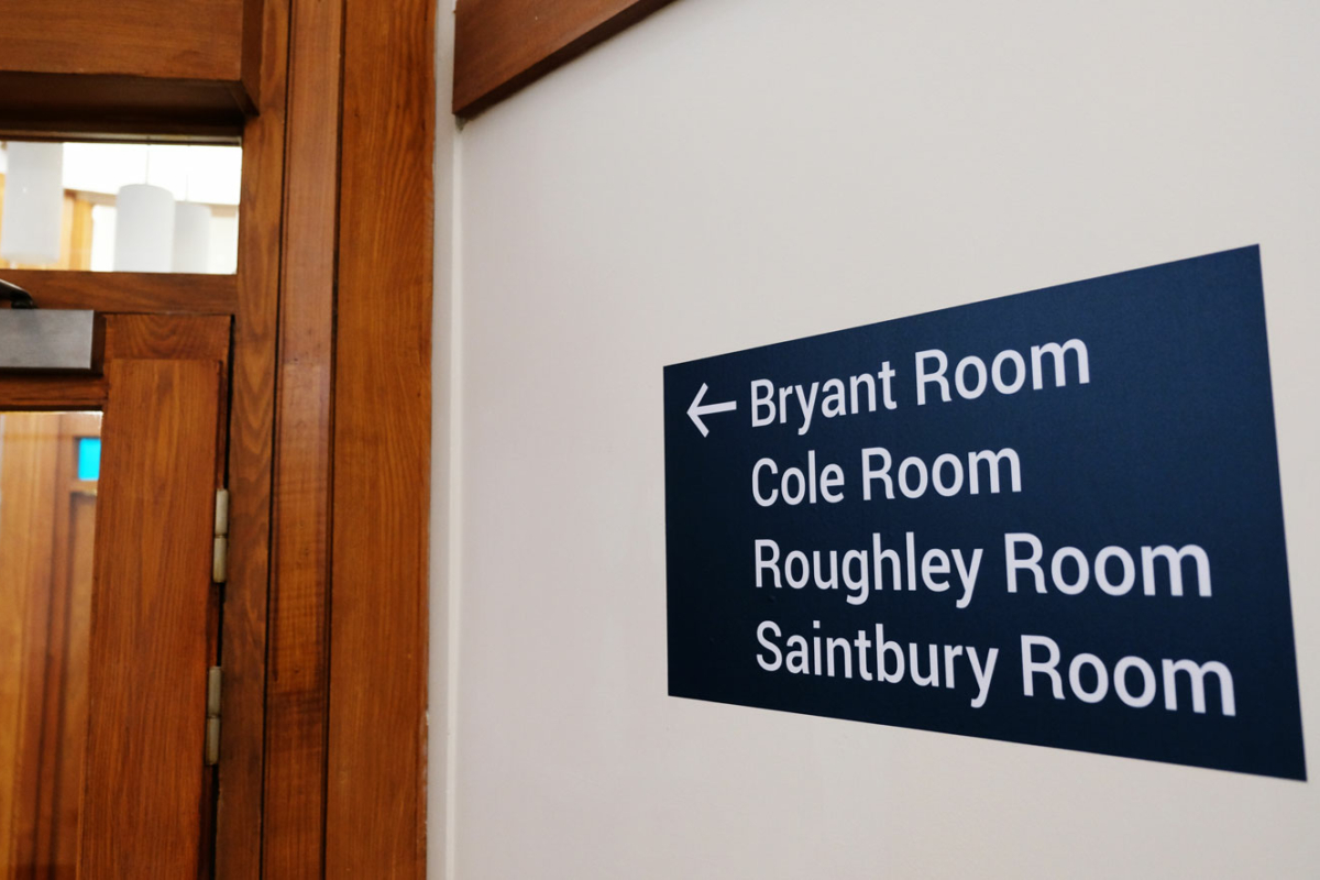
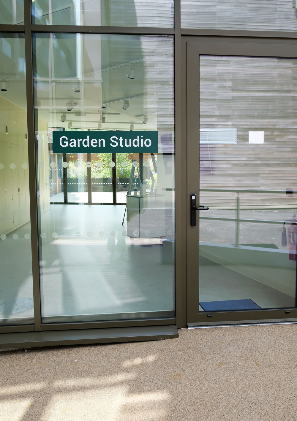
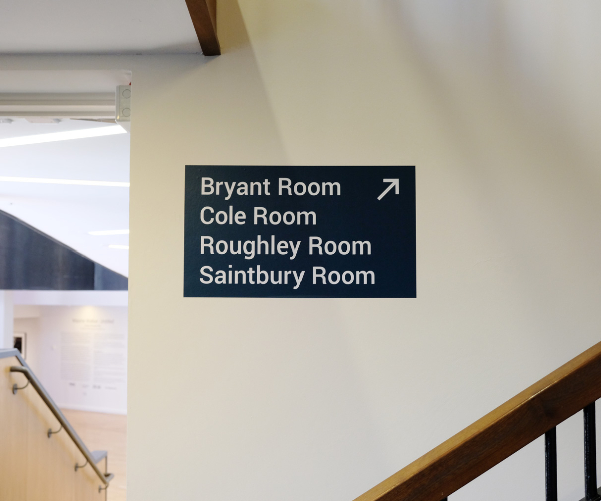
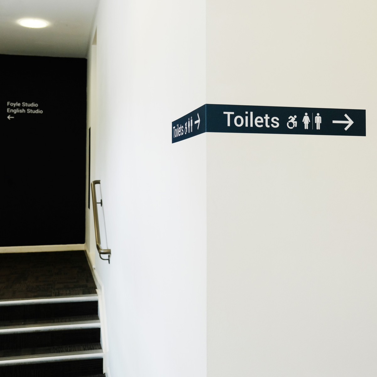
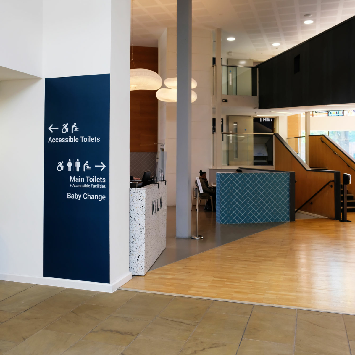
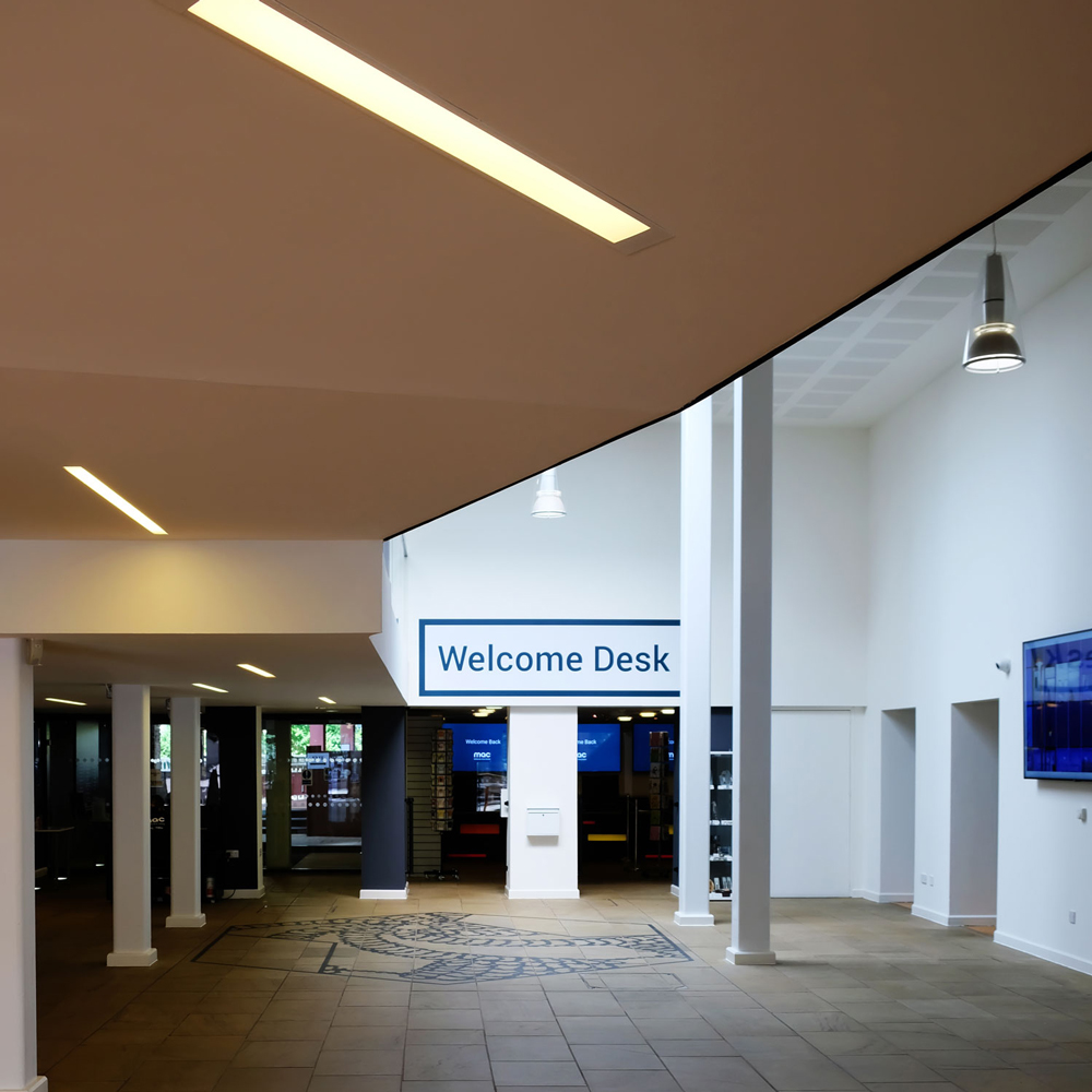
The design system I created helped the venue to consider relevant placement on walls and doors around the building along with ensuring consistency of lettering size and iconography. Sight lines from different levels of the building were also used to help determine where the new signage was installed.
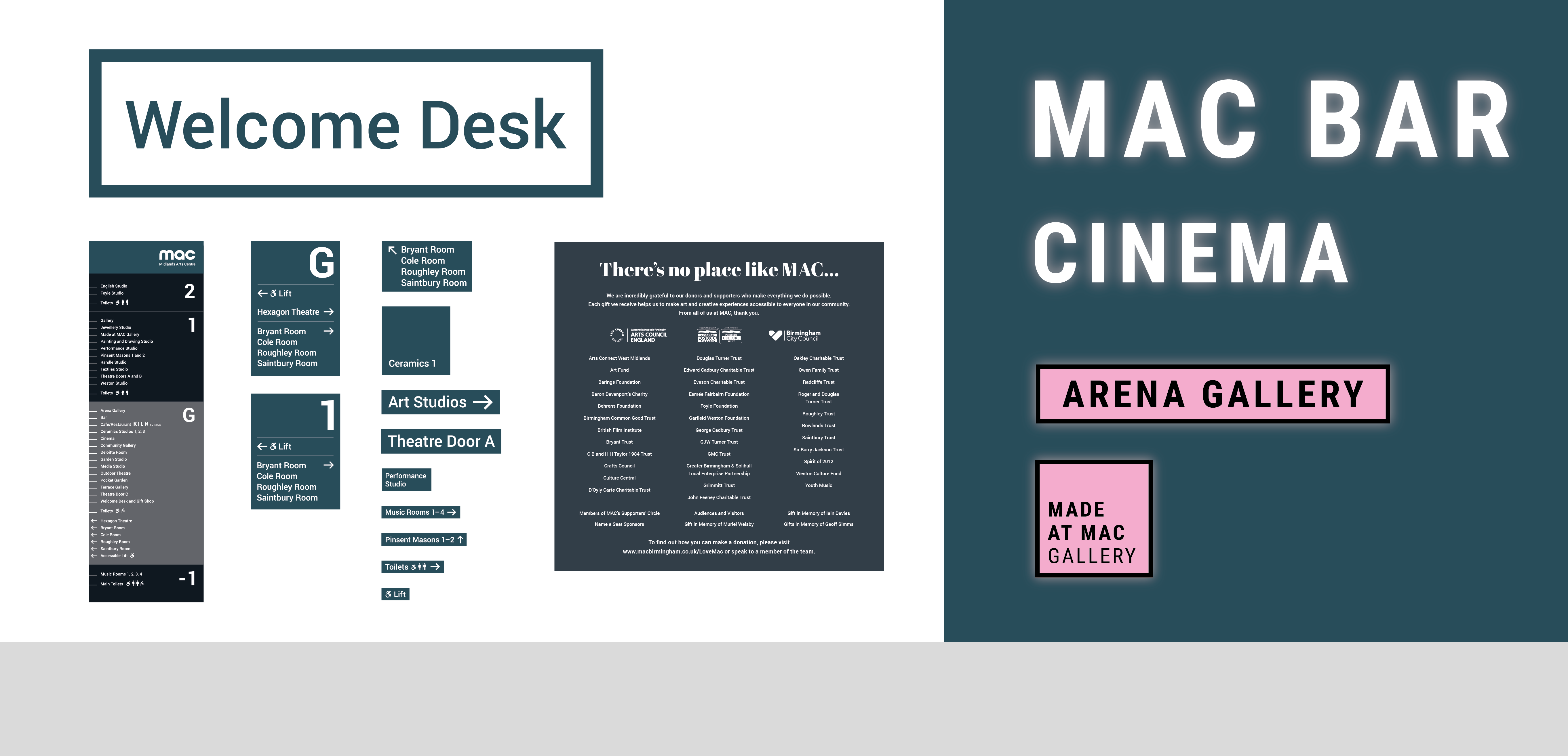
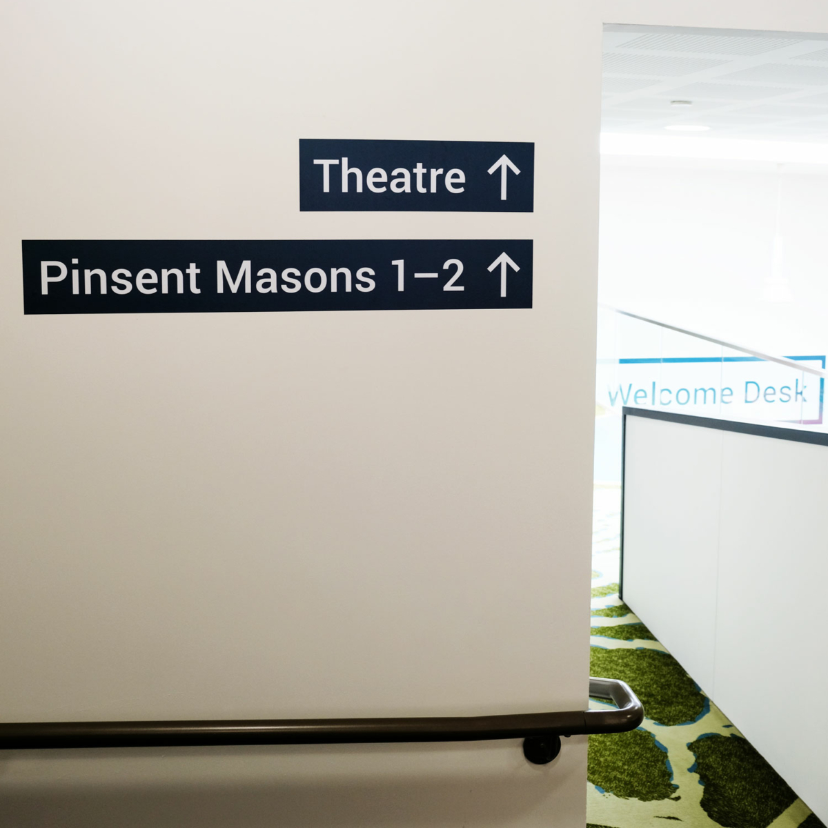
The new system is clean and modern in order to work compatibly with the building environment and different areas of the centre, along with being in line with MAC’s existing brand identity. Vinyl directional signs in petrol and racing green from the mac palette sit clearly on white walls.
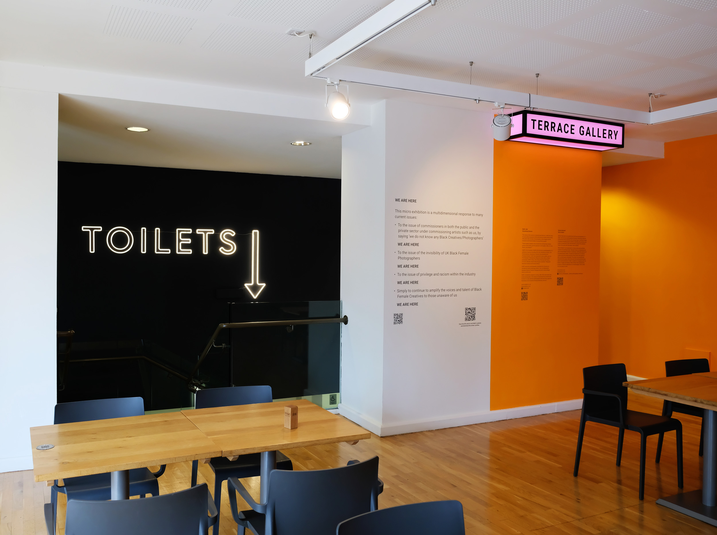
Bespoke lightboxes were designed for each of the gallery spaces, providing a playful opportunity to inject personality and colour. A fresh neon pink helps to draw the visitor’s eye and create a sense of place.
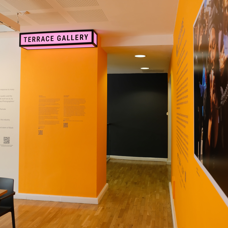
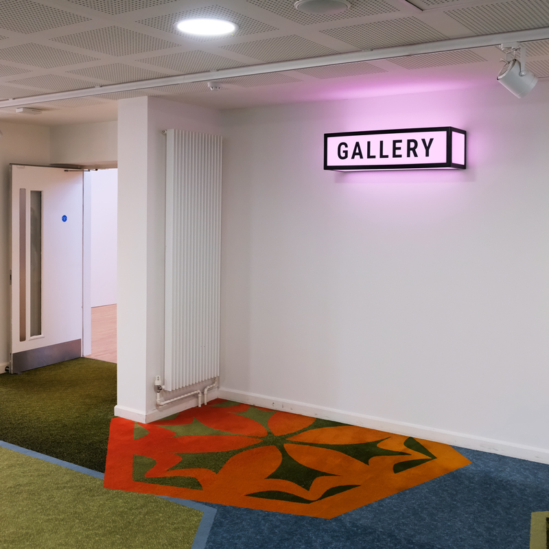
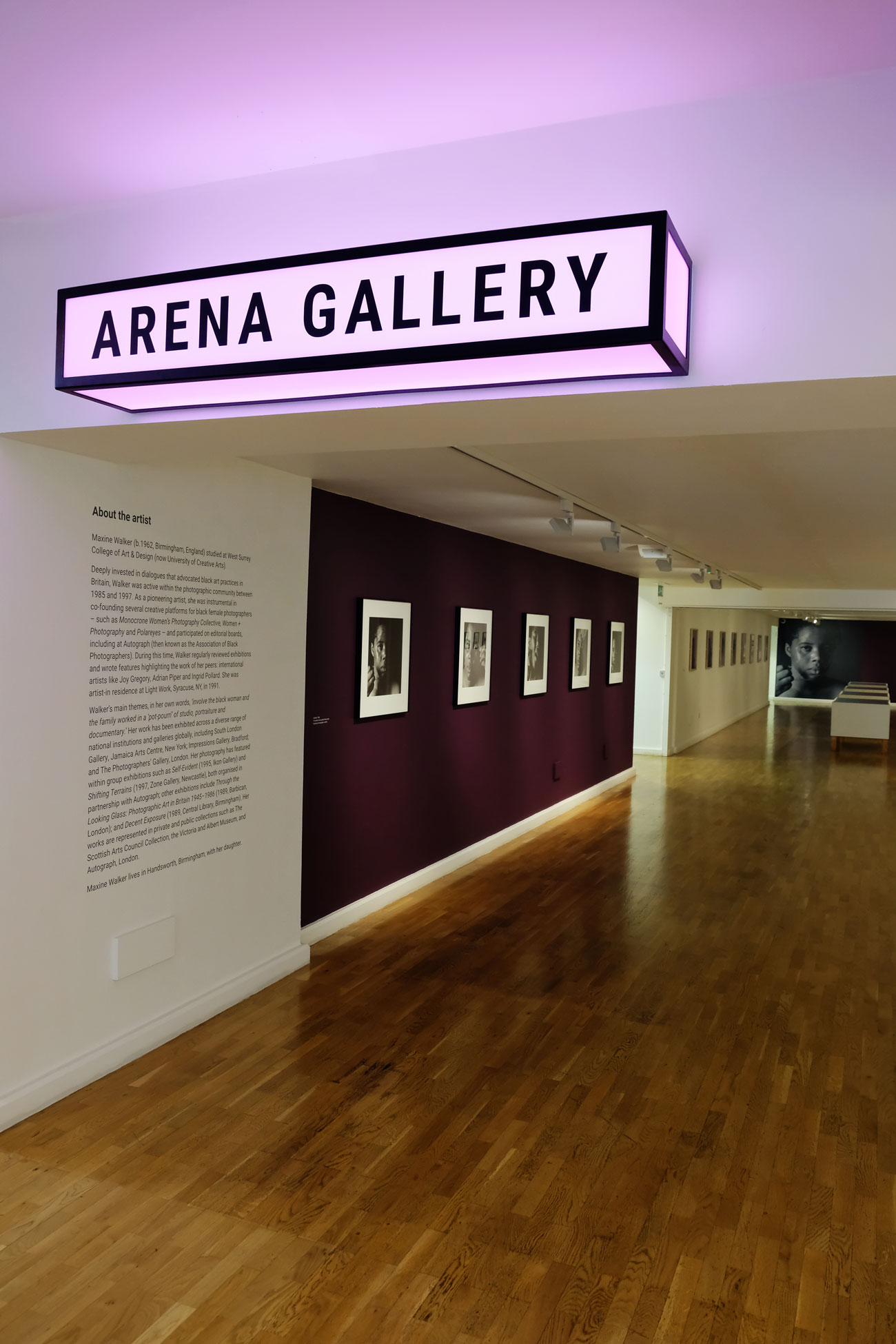
Bespoke lightboxes were designed for each of the gallery spaces, providing a playful opportunity to inject personality and colour. A fresh neon pink helps to draw the visitor’s eye and create a sense of place.


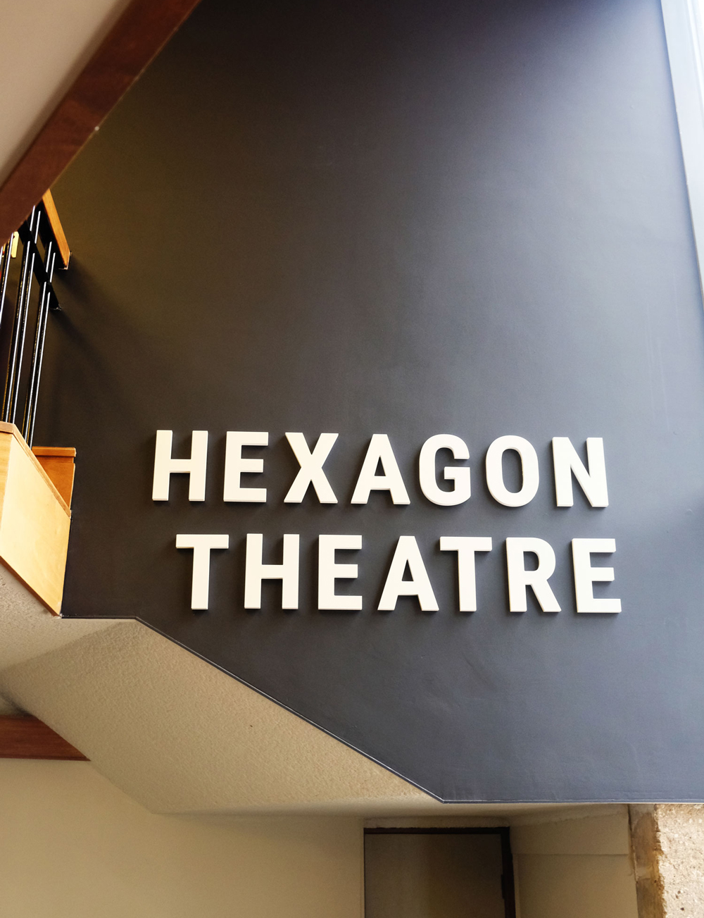
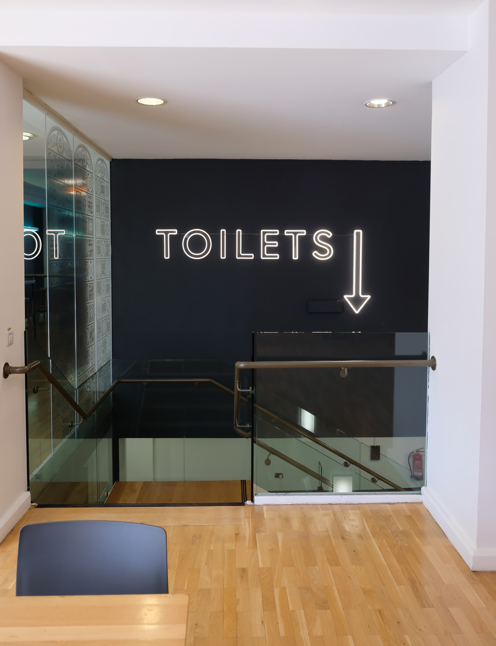
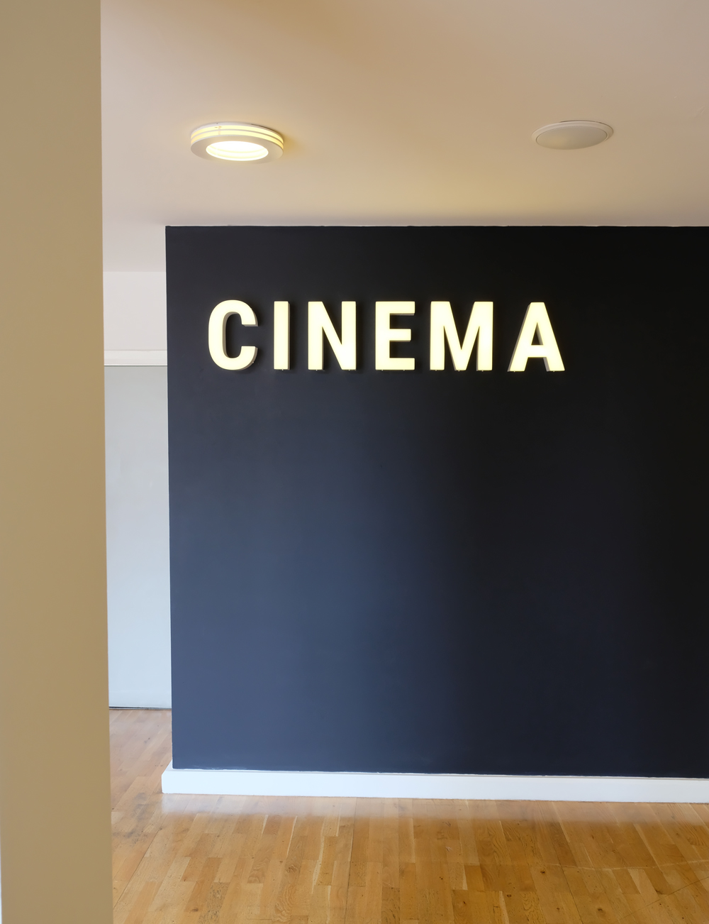
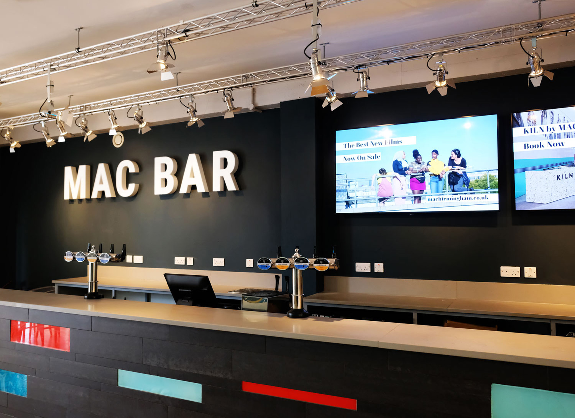
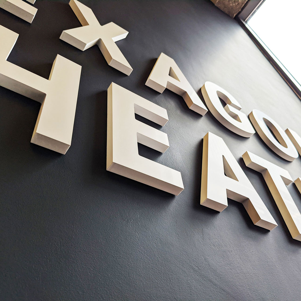
A combination of raised lettering, front face lit lettering and neon signage identified the bar, cinema and theatre spaces. To aid a unique problem to MAC, which sees visitors often getting lost when trying to find the main toilets, the neon signage feels playful and cheeky with an oversized arrow pointing to the location.


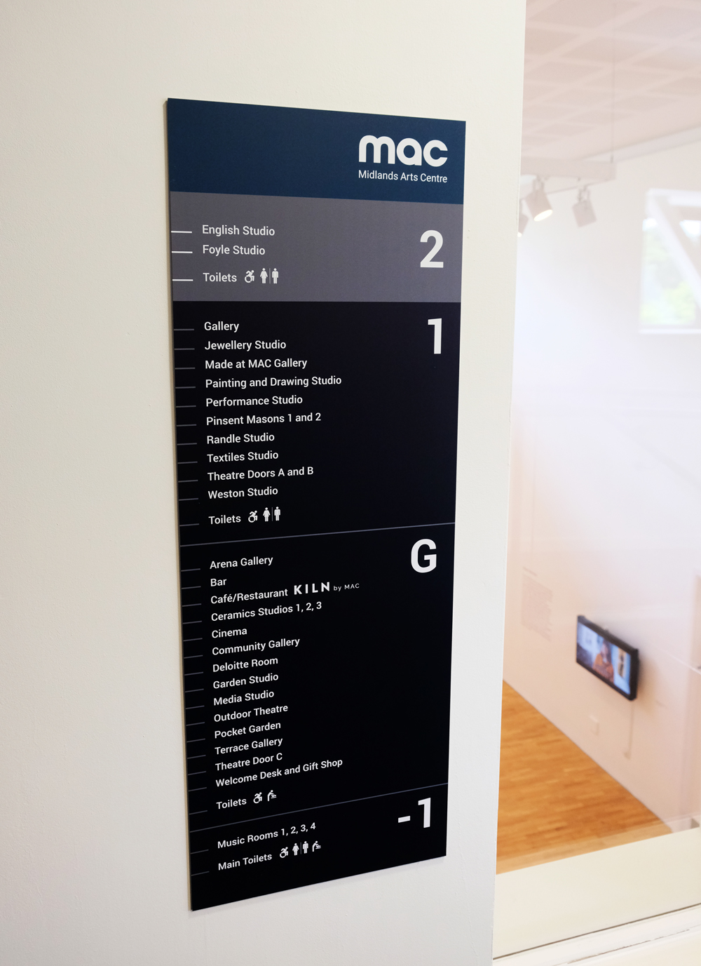
All lift entrances around the centre are now accompanied by bespoke dibond panels which clearly list facilities on each floor, aided by visual icons where applicable. Consideration was given to type size and positioning in the space to ensure the panels were accessible for all.
All signage elements were manufactured and installed by DIS Graphics.
You’ve been a dream to work with – calm, constructive, creative, flexible and such careful attention to detail.
Simi Obra – Head of Marketing, MAC
