
Revival
The Opportunity
Revival is a home improvement and support specialist in the Staffordshire region. Previously part of the Staffs Housing Group, this sector brand was given the new name Revival and a revitalised brand strategy by Birmingham agency Orb.
I was commissioned to create a fresh new identity to help tell the story of how this brand brings a home to life through its wide range of services, helping everyone within the community feel safe and well in a home they love.
The Solution
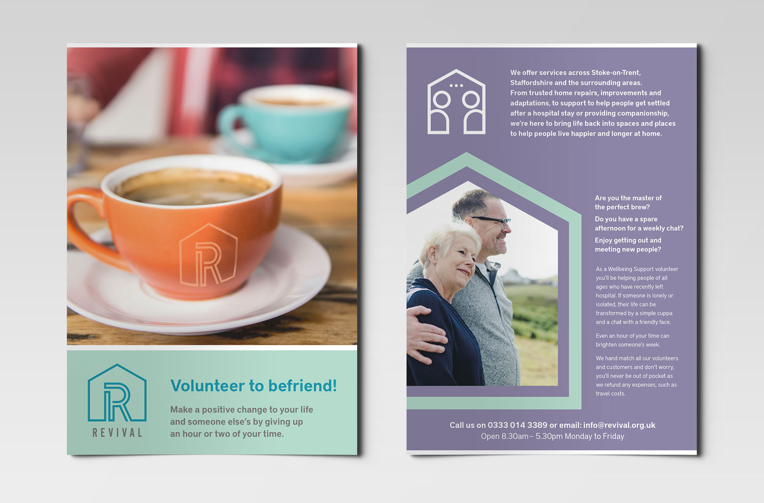
This new identity had to communicate a caring and accessible brand which offers a diverse range of support services – from helping someone tackle a repair for their changing accessibility needs, to providing companionship to someone who feels isolated, the Revival team aim to bring life back into spaces and places to help people live happier and longer at home.
An idea from initial moodboard sessions around some kind of wire framework, which references both aspects of home improvement and important personal connections, soon became an integral part of the Revival logo development.
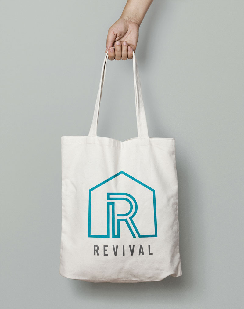
The Logo
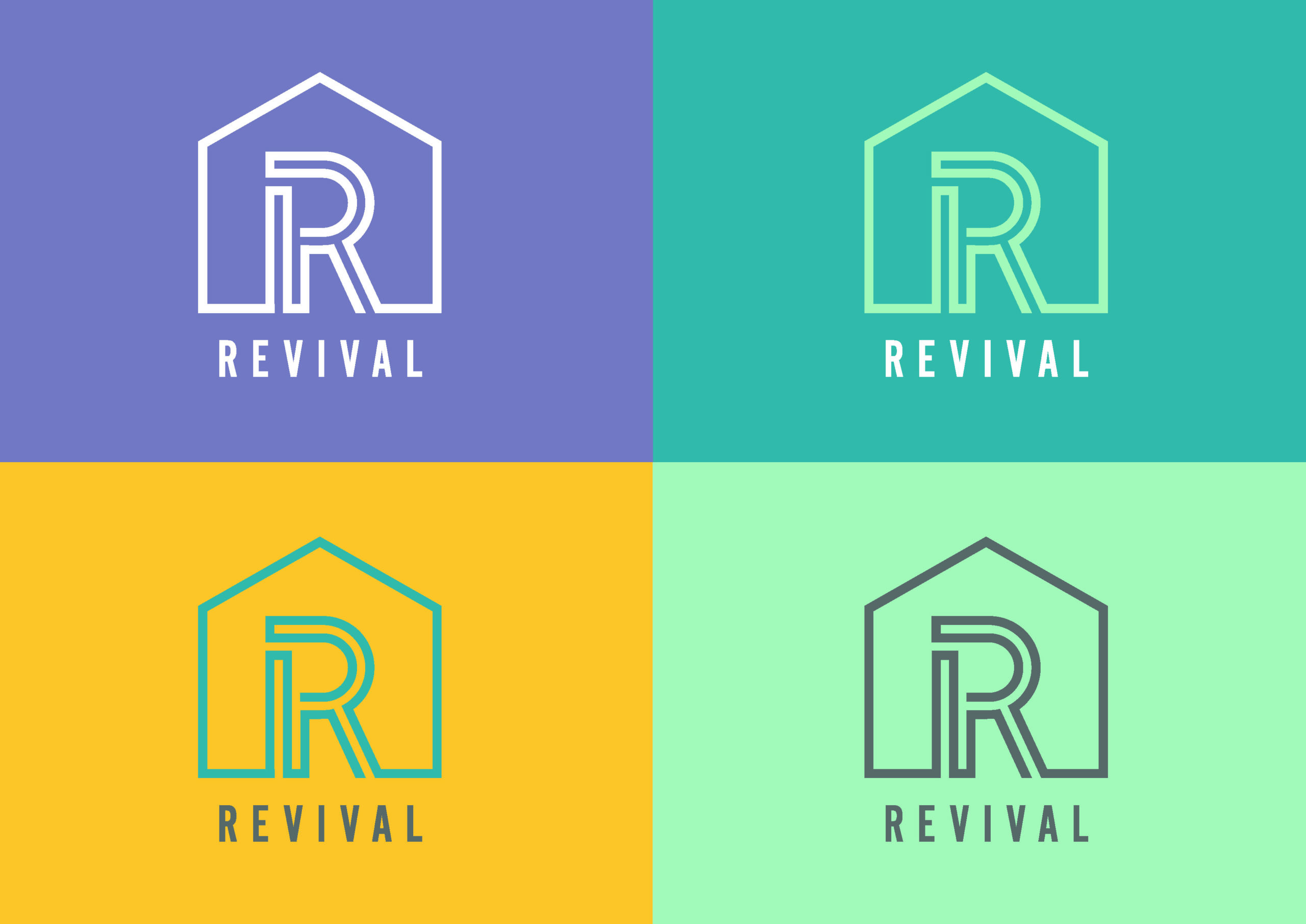
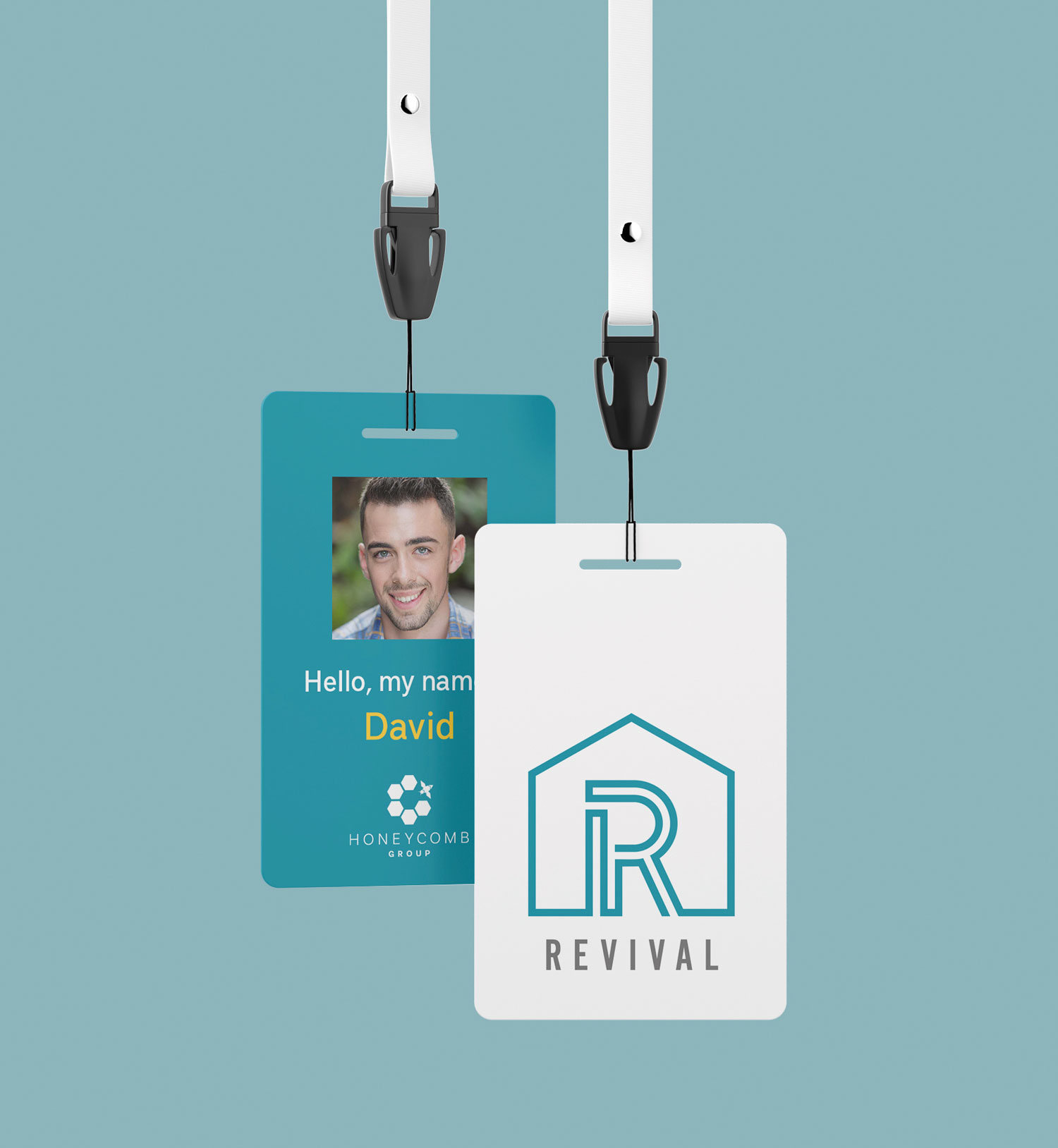
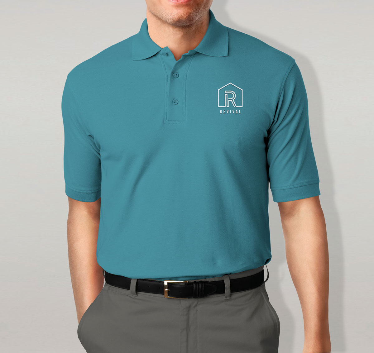
The new logo centres around a letter R, constructed in the centre of a graphic house outline. The ‘R’ sits centrally within the new mark and is made up of interconnecting lines, referencing the wealth of services which sits under this one brand proposition.
It was important to the Revival team that this iconic mark would be impactful and communicate that Revival are the go-to specialists in home improvement and support. A condensed typeface in uppercase appears trustworthy and accessible.
Consideration went into the colour palette of a warm teal, lilac and soft mint to ensure the new look and feel communicated the customer-friendly and human approach of the brand. An additional accent colour of vibrant yellow gave the palette flexibility in order to present a commercial and professional image for those customers who interact with the home improvement element of their service.


Service Icons
As part of the identity I also developed a set of six icons which show the unique service areas that Revival offers. Each icon incorporates the house frame to surround the graphic. The icons enable simple and clear communication for the six services on offer and can grow to incorporate more if required in future.
Accompanied by carefully curated photography, which shows home improvement scenes and images which reference the different facets of human contact through the care and support services, this new brand is brought to life.
When you put the time in to build a strong client relationship, you need partners you can trust to deliver great work and provide expertise. Lindsay's work went above and beyond expectation. She nailed the brief and delivered exceptional creative work, all within time and budget. There's nothing I wouldn't trust in her capable hands.
Courtney Patrick, Brand Strategist @ Orb
The experience and quality of service we received from Lindsay as part of our re-branding project was exceptional. Lindsay worked alongside our team throughout the process, questioning us on our vision and hopes for the new brands and interpreting them in a way that brought them to life and staff and customers can instantly recognise and relate to our services and culture.
Diane Thompson, CEO, The Honeycomb Group
Revival is part of the Honeycomb Group family of social-minded brands. You can view these other casestudies below…


