
The Honeycomb Group
The Opportunity
Staffordshire Housing Group were looking for a new brand identity which could help breathe new life into their communications, and help them to achieve simplicity, clarity and alignment for all the services which they provide as a group. Birmingham branding agency Orb were working with the group to write a new brand strategy and vision to enable the distinct service areas to feel more cohesive, and I was brought on to help develop the visual identity which was a recommendation of their research.
A change of name to “The Honeycomb Group” would allow a new umbrella brand to be created, which all of the service areas could then sit beneath. This new group brand, without an overt mention of “housing”, would allow them to enhance their market reputation and increase awareness for their work with domestic violence, homelessness and other support services.
Previous group logo
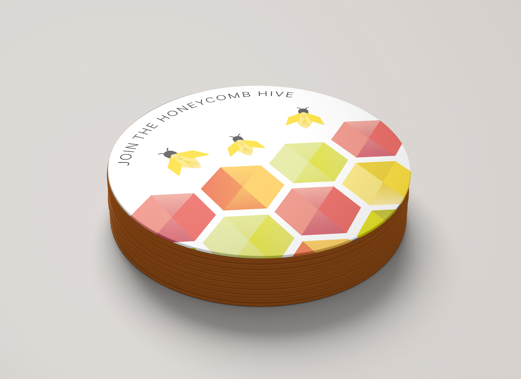
New group logo
The Logo
The group brand was the first identity to be designed. This brand had to communicate the shared group vision and capture the essence of their work and impact.
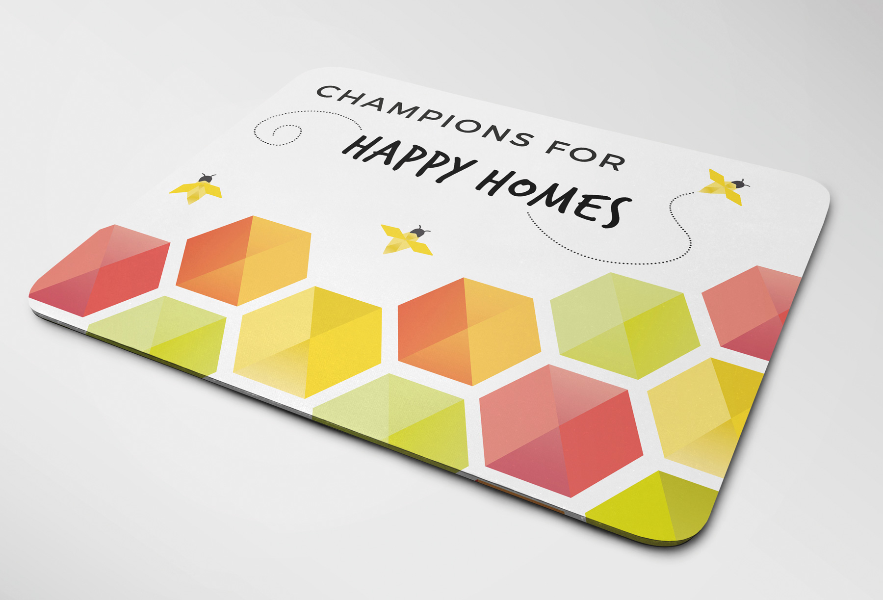
So with a nod to the brand’s history, the circle formation in the existing logo was revitalised to form a vibrant and colourful honeycomb shape featuring 5 hexagons in tones of red, orange, yellow and lime green. The shape resembles a flower and it is welcoming a bee into its heart. The bee has a unique geometric quality allowing the brand’s individuality to shine through. The logo begins to define how the group provide more than just housing and the formation of the geometric shapes and colours hints at how they are united towards a greater purpose.
Typography is set in a stylish, balanced sans serif font, and uppercase letters allow the brand to make a statement as a leader in its field.


Along with the use of the new brand name, the organisation’s team now becomes the Honeycomb Hive, working fruitfully in partnership to create a more vibrant region. The bee offers a playful way to bring energy, movement and an element of storytelling into the group’s brand collateral and comms pieces. A set of multiple bees was created, in different sizes and at different points of flight, which could be used within new campaigns such as #jointhehive.
Along with the use of the new brand name, the organisation’s team now becomes the Honeycomb Hive, working fruitfully in partnership to create a more vibrant region. The bee offers a playful way to bring energy, movement and an element of storytelling into the group’s brand collateral and comms pieces. A set of multiple bees was created, in different sizes and at different points of flight, which could be used within new campaigns such as #jointhehive.

The Identity
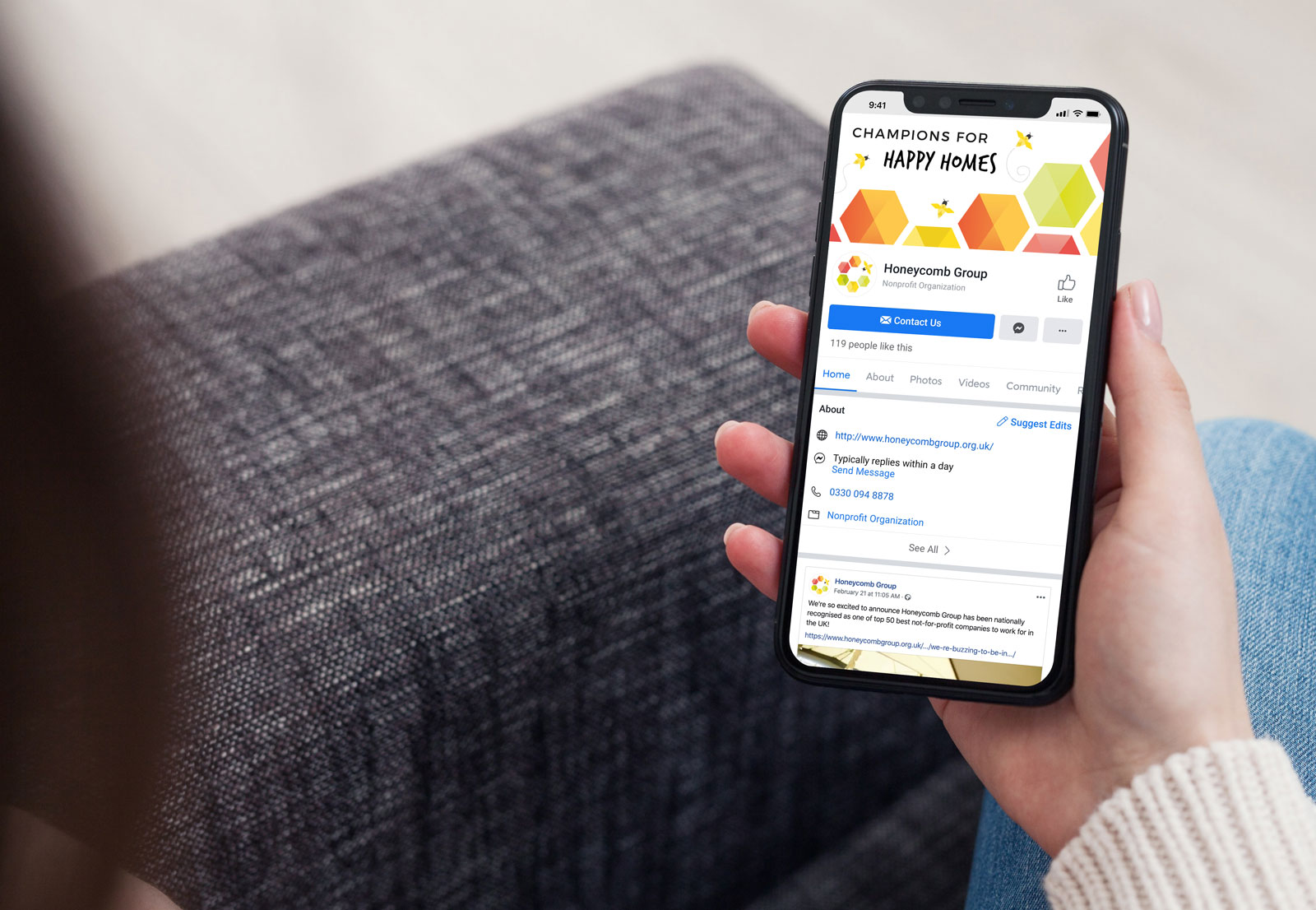
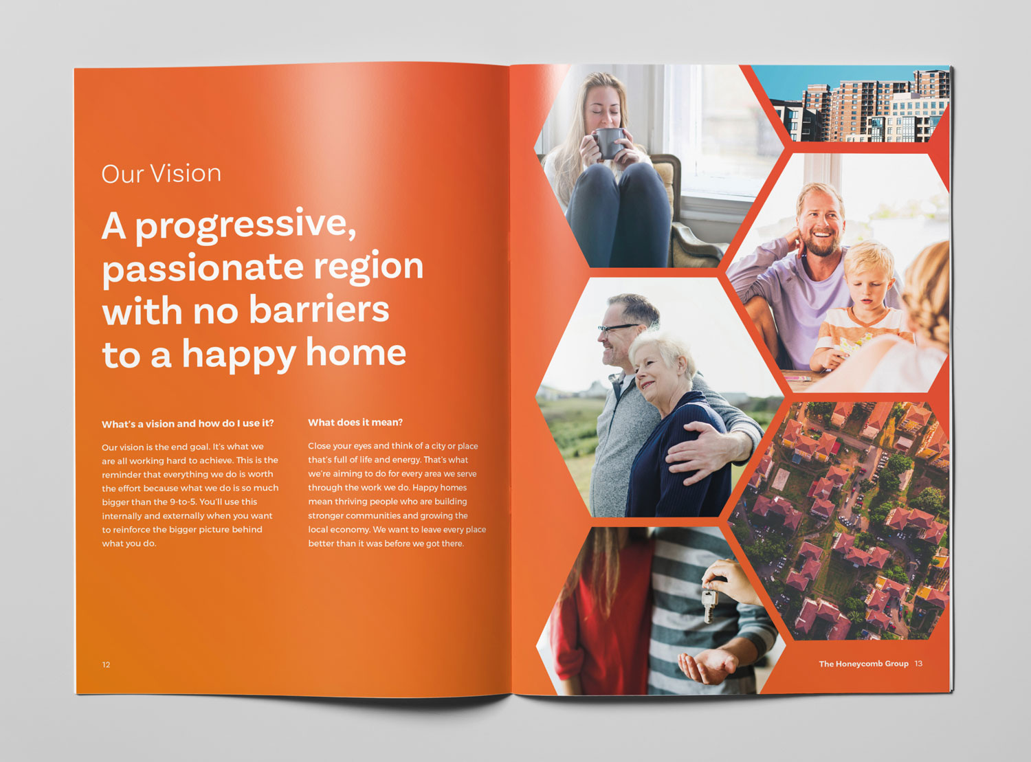
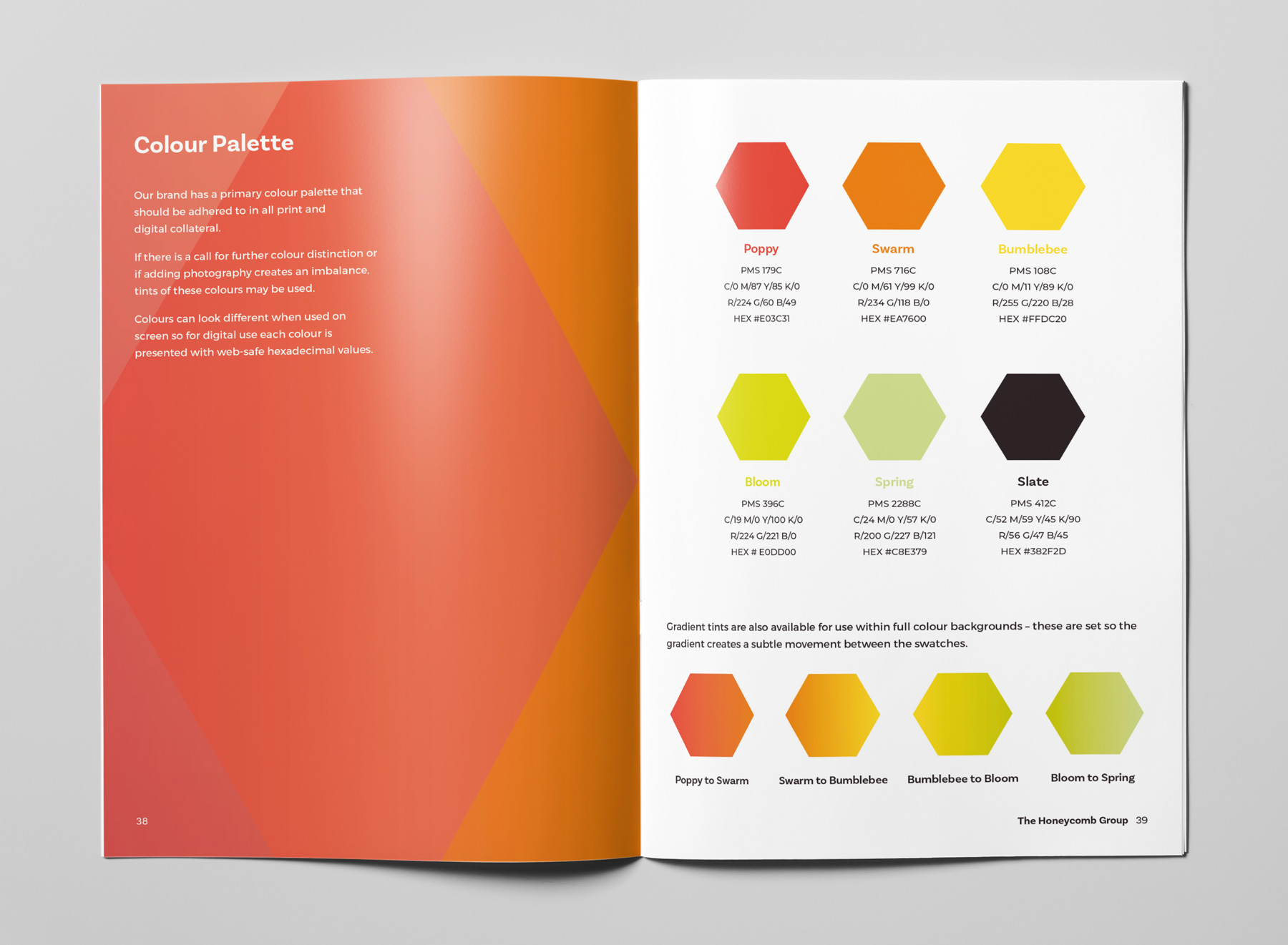
The new group brand is clean, contemporary and popping with vibrant colour and warm tonal gradients. Playful typography and careful use of photography help to reinforce the group’s mission to find people a happy home.
This new identity now provides a meaningful gateway to discovering the other social-minded brands which sit within the group and allows for greater brand awareness in geographic catchments outside of Staffordshire, helping to maximise the scope of the group’s work.

When you put the time in to build a strong client relationship, you need partners you can trust to deliver great work and provide expertise. Lindsay's work went above and beyond expectation. She nailed the brief and delivered exceptional creative work, all within time and budget. There's nothing I wouldn't trust in her capable hands.
Courtney Patrick, Brand Strategist @ Orb
The experience and quality of service we received from Lindsay as part of our re-branding project was exceptional. Lindsay worked alongside our team throughout the process, questioning us on our vision and hopes for the new brands and interpreting them in a way that brought them to life and staff and customers can instantly recognise and relate to our services and culture.
Diane Thompson, CEO, The Honeycomb Group
The Honeycomb Group family of social-minded brands includes Concrete, Glow, Revival and Staffs Housing. You can view these other casestudies below.


